Zafran Brand Identity
An abundant, flavour-led identity rooted in saffron, natural ingredients, heritage and a promise of excellence.
Explore the system ↓
Designed for recognition at every scale.The essence of Zafran
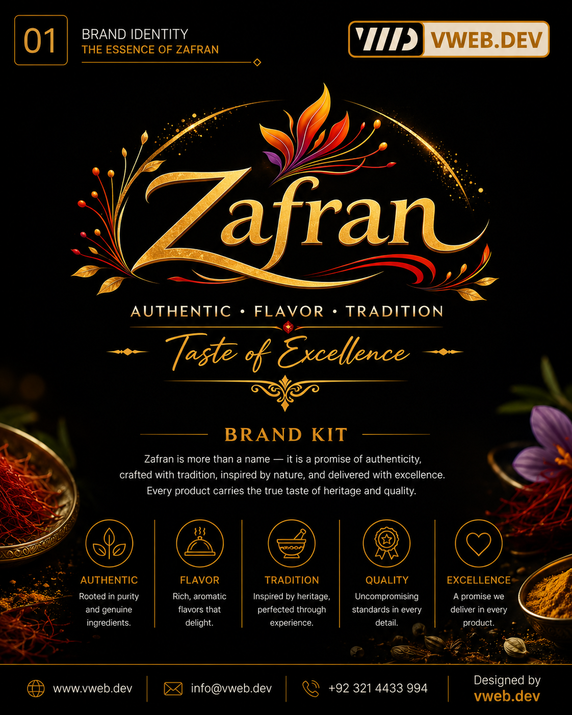
Authenticity, flavour, tradition, quality and excellence introduce a premium food identity inspired by nature and saffron heritage.

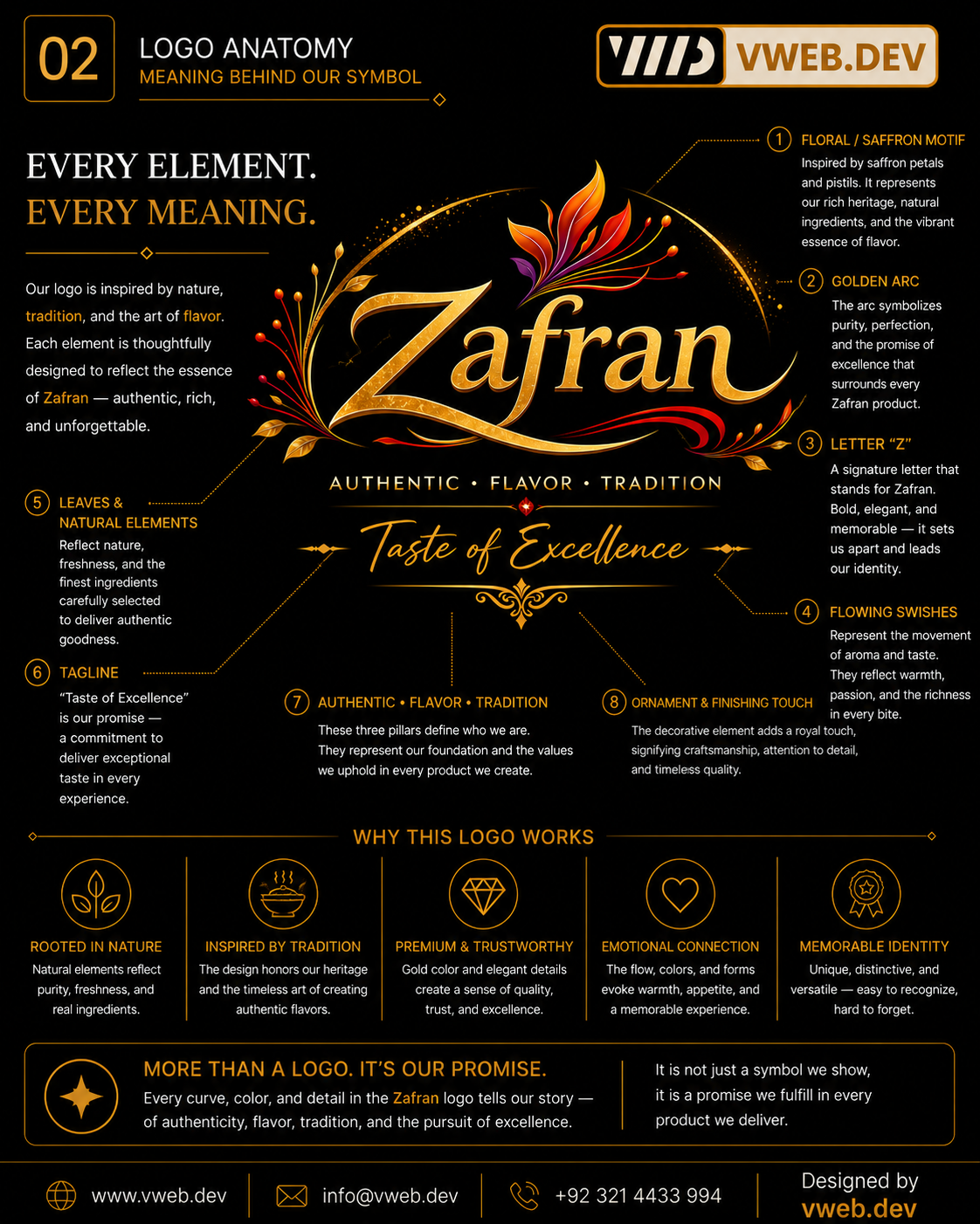
Every element, every meaning
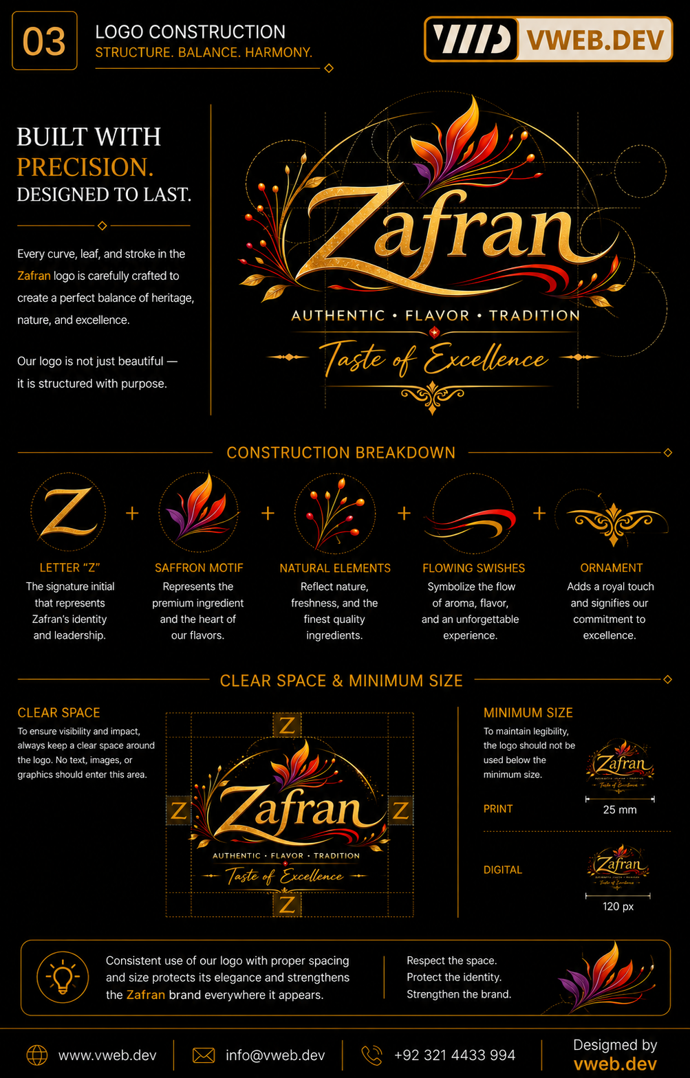
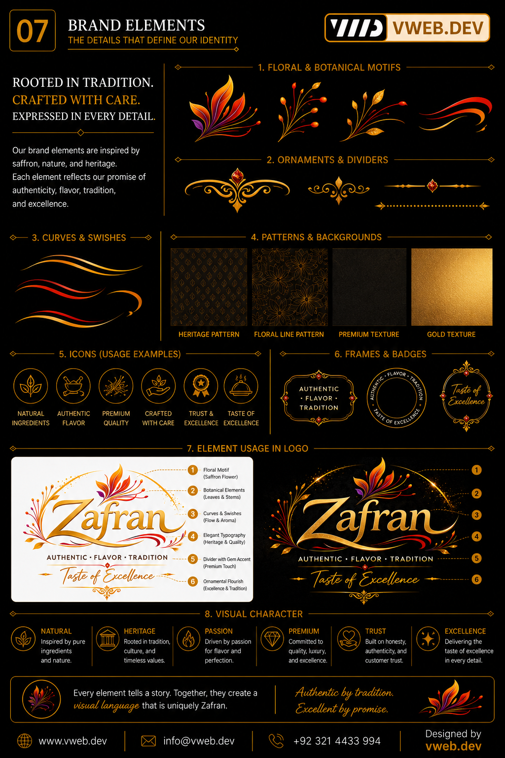
The saffron flower, golden arc, signature Z, flowing aroma swishes, leaves, tagline and ornament combine heritage with an expressive flavour story.

Structure, balance and harmony
The construction grid breaks the mark into letter, flower, botanical, motion and ornamental components and defines clear space and minimum size.

The colours of heritage
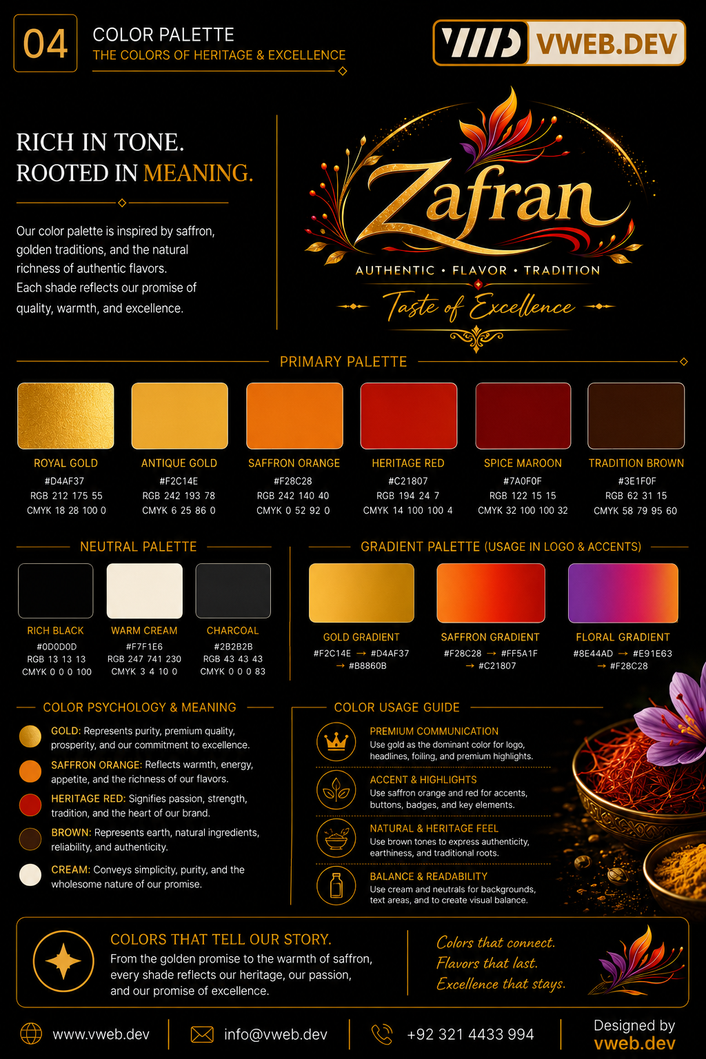
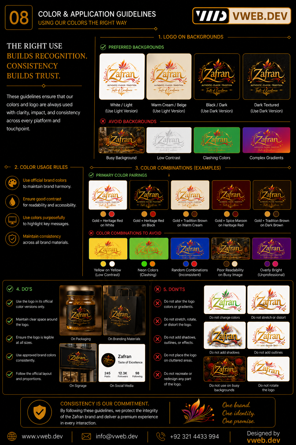
Royal and Antique Gold meet Saffron Orange, Heritage Red, Spice Maroon, Traditional Brown and warm neutrals to communicate appetite and craft.

Words that carry heritage
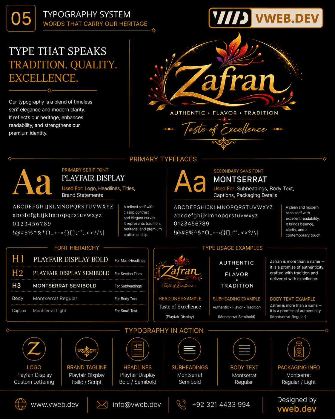
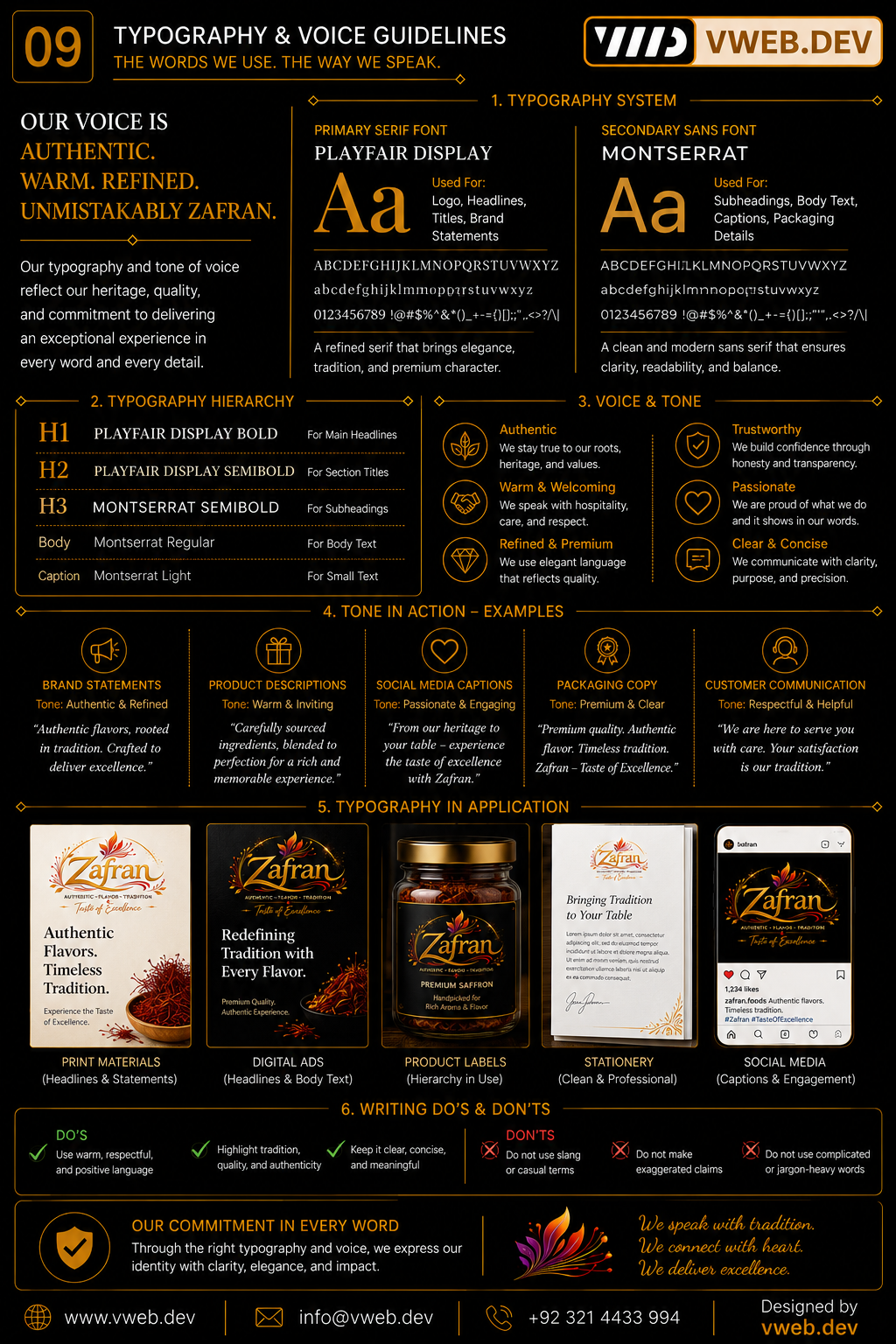
Playfair Display supports premium storytelling and custom lettering; Montserrat handles clear packaging details, captions and supporting information.

A flexible signature
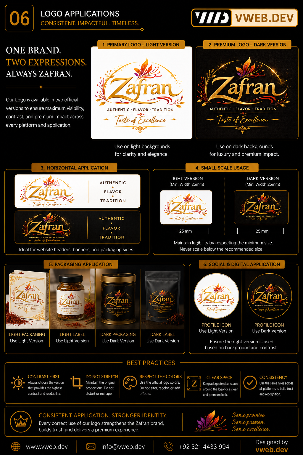
Approved primary, reversed, simplified and compact expressions let the detailed identity scale while protecting its recognisable core.

Botanical details and flavour cues
Saffron petals, leaves, swishes, ornaments, icons and patterns create a rich supporting toolkit for packaging and communication.

The promise on shelf
Labels, containers, boxes and presentation materials turn colour, ornament and hierarchy into a premium food-packaging experience.

Texture, ingredients and appetite
Warm dramatic light, close ingredient detail, natural texture and rich serving scenes make the product world feel authentic and abundant.

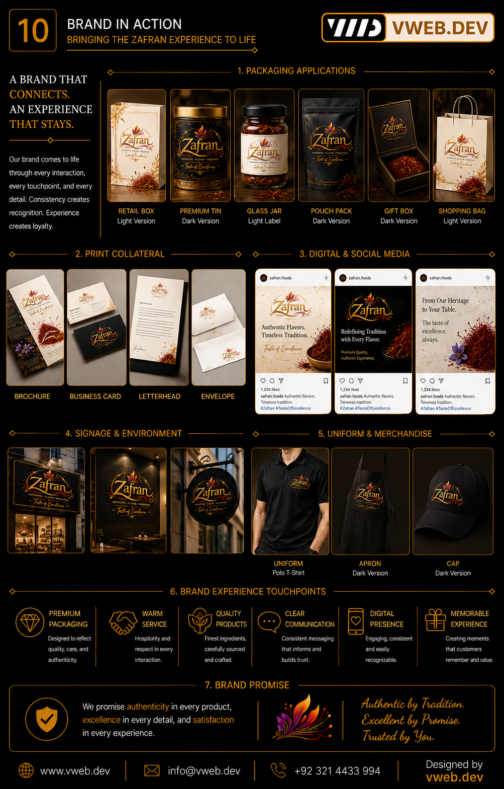
Authentic flavour everywhere
Retail, digital, collateral and campaign examples demonstrate a consistent expression of tradition, quality and taste.

Selected digital work
Start a project ↗